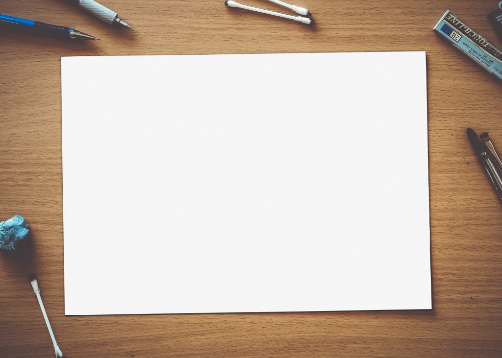
There’s a common misconception among marketers – especially in the visual world that we’re now living in – that white space is somehow a bad thing.
If there’s white space on a page filled with text, you’d better write more words to get rid of it. If there’s white space on your home page, you’d better throw a few more images in there to fill it. People just aren’t going to be able to take you seriously unless you cram as much information onto a piece of content as possible.
 Make absolutely no mistake about it: none of this could be further from the truth.
In reality, white space isn’t just an essential part of the proper content marketing design – it may very well be the biggest asset that you have available to you. Understanding how to appropriately wield that tool is your key to creating better, more engaging content moving forward.
Why White Space is the Best Friend a Marketer Could Ever Have?
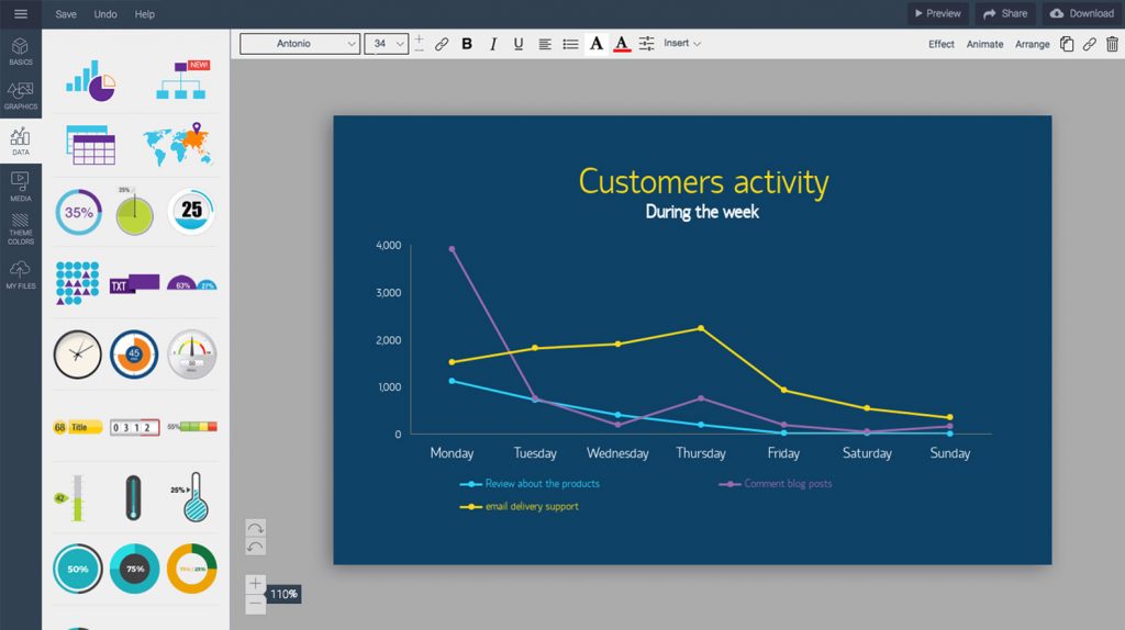
 To get an example of this idea in practice, consider what usually happens when you sit down with a line graph maker like Visme (which I founded). Naturally, a line graph is a great way to not only track the trajectory of something over time but to also view the changing relationships between multiple ideas.
Each line on the graph represents a different concept and thanks to the way they’re presented, you can see them all as individuals and in relation to one another.
Now, imagine that same line graph had dozens of different lines, all in similar colors to one another. Suddenly, your ability to contrast is gone because everything blends together. Where do one line end and another begin? What is the ultimate point of all this? What was it that you were supposed to learn, again?
 In an instant, the idea you worked so hard to create is lost.
Now, think about the same line graph with three, maybe four lines maximum. At that point, each one stands on its own in a way that is easy to digest both as an individual and as a group. You’re making the exact same point, but you’re doing so in a more visually appealing and easier to understand – way.
But it’s not because the bar graph has fewer lines now – it’s because white space is acting as the proverbial period at the end of the sentence if you will.
In that specific example, the white space isn’t getting in the way of your point – it’s underlying it.
This is why you need to start thinking about the ultimate layout and design of your content as early on in the creation process as possible. Even when you’re using a service like Respona to research the types of topics that your audience members care about, it’s literally never too early to start thinking about how it will all eventually look on a page.
 It doesn’t matter what type of content you’re talking about, either. White space is just as important for a 10,000 word white paper (no pun intended) as it is for a photo-based presentation or some other type of visual-heavy material. If white space is there, it is to be utilized – end of the story.
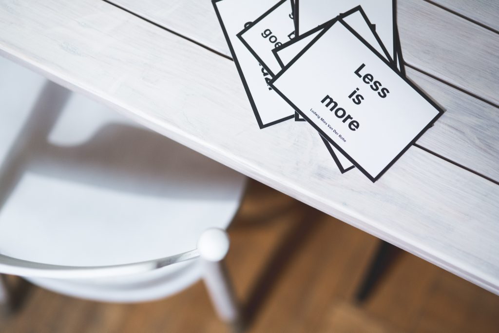
If there’s a certain point that is particularly important, give it room to breathe – put it on a line all its own. Use shorter sentences to build momentum until you get to that powerful crescendo. Control the pace someone experiences your ideas by playing around with paragraph lengths or even their overall structure. All of this will ultimately impact the overall experience they have, along with whether or not they’ve enjoyed it.
At the end of the day, never forget that white space does a lot more than just improve legibility (although it does do that quite well, and that is very important, too).
 White space demands attention.
White space draws users into the design instead of keeping them at arm’s length.
White space is the perfect way to get someone to focus on a single word, or image, or idea.
But more than anything, white space increases the impact of the content you’ve worked so hard to create.
It’s that impact that will turn something from a passive experience to an engaging one that your target audience members won’t be able to get enough of.
Guest Author Bio: Payman Taei is the founder of Visme, an easy-to-use online tool to create engaging presentations, infographics, and other forms of visual content. He is also the founder of HindSite Interactive, an award-winning Maryland digital agency specializing in website design, user experience, and web app development.